BuzzData.com – A Social Network for Data Journalists

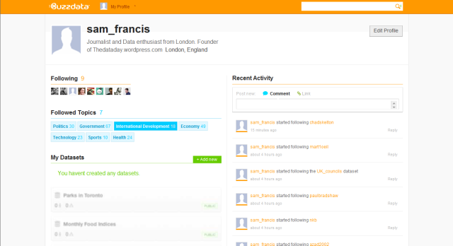
Picture of Buzz Data Profile page with Orange Header showing features similar to Twitter and Facebook
A BuzzData user profile page

Earlier this month data journalism got it’s very own a social network with the launch of Toronto-based website BuzzData.

Users of this new service can upload data, visualisations, articles and background on a topic or story for other users to ‘follow’ and pore over themselves.

The thought of sharing secretive scoops and hard-fought for data would cause a prickly sweat to form on the back of most journalists necks.

But this is by no means the first attempt to connect journalists working with data sets (Socrata, Paul Bradshaw’s Help Me Investigate, and to a lesser extent the public nature of Many Eyes).

We at TheDataDay think this new, more community focussed attempt could be a major step towards breaking down the silos of information that build up amongst journalist.

How does Buzz Data Work?

By way of an explanation of their mission BuzzData quoted the words of Antoine de Saint-Exupery:

If you want to build a ship, don’t drum up people together to collect wood and don’t assign them tasks and work, but rather, teach them to long for the endless immensity of the sea.

Once signed up users upload data sets and any related articles, data visualisations, and any background documentation on a topic or story.

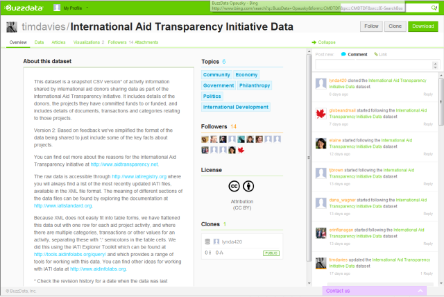
Screengrab from Buzz Data's data page showing a brief desciption of selected data on international voluntary aid witha green banner at the top of the screen

Each data set is given its own profile which allows users to build up a conversation around the data, either by leaving comments or linking and adding their own relevant information to the mix – progressively, or so the idea goes, adding more context.

Buzzz Data Allows users to publicly talk and discuss possible ways to improve uploaded content

Publishing the information publicly allows anyone to clone and download the raw data, but BuzzData also allows you to upload sets into closed networks (allowing some of the traditional journalistic smoke and mirrors to remain).

How will BuzzData help us data journalists?

BuzzData hope that their site will one day be a place where not only journalists, but policy makers can come together in  and innovate.

In an interview with Journalism.co.uk Mark Opausky, CEO of BuzzData said:

“[BuzzData] allows the story to live on and in some cases spin out other more interesting stories. The journalists themselves never know where this data is going to go and what someone on the other side of the world might do with it.”

According to BuzzData’s own blog :

“Our goal is to create a place where users — whether they’re individuals, news agencies, science labs, governments — have the power to publish, build, revise and expand existing data into information that’s more current, accurate, accessible and ultimately useful than any version of data they might create alone.

Social functionality and easy dataset publishing is just Stage 1 of BuzzData’s ultimate vision. We really hope you’re enjoying it. Stay tuned, because there’s a lot more in store for you.”

And with over $1 million of investment already secured we at TheDataDay think that it might not be a bad idea to get in at the ground floor of this venture.

Users can sign up here. Let us know your experiences in the comment section below.

Posted in Commercial, Data Releases, Data tools | Tagged , , , , , , , , , , , , , , , , , , | Leave a comment

An Argentinean Hackathon

An exciting development in the international data visualisation world is next weeks Hackathon in Buenos Aires.

On 13 August the press room of the Tecnopolis science and technology park in Buenos Aires will play host to a day of computer programming betweenArgentina’s investigative journalists and top programmers.

Attendees will hope to build on Mapa76.info [spanish webiste], an internet software tool that extracts and visualises data from text documents, and applying it to the vast paperwork associated with Argentina’s brutal dirty war from 1976-1983.

Mapa76.info is the product of the last Argentine Hackathon in Rosario(as part of the 4th Digital Journalism Forum of Rosario [spanish webiste]) where journalists and programmes got together to work for on interactive applications for HTML5 in audiovisual media coverage.

If successful next weeks project will create an automatic visualisation of the realities of the dictatorship put together from court evidence, arguments and sentences.

To give shape to such a turbulent time will provide a platform for vital future investigations and TheDataDay will keep you posted on any and all of the results and developments for the world of Data Journalism.

To enter the Hackathon in Technopolis you must enrol  here and confirmed your participation in the event.

Schedule:
10:30 a.m. Present the project and show the possibilities of the software.
12:00 p.m. The hackathon begins: advancing the development of the code and the accumulation of content.

7 pm – 9 pm Presentation of results to the general public

Instructions For Journalists:
Bring documents of testimony, lawsuits, sentences, newspaper articles, etc., in text document format (.Doc, .Odt, rtf, etc.), and think of how it would be desirable to view them.

Instructions For developers:
* Improve the interface for loading documents and data extraction (Ruby/jQuery)
* Improve the query interface for data (timelines, maps, document viewing) (Ruby/jQuery).  The project is developed in Ruby, Sinatra, MySQL, jQuery. The code will be released at mapa76.info.

The event hosted by Argentinean wing [spanish webiste] of American based forum Hacks and Hackers.

To view relevant article on Hacks and Hackers website click here.

Posted in Data tools, visualisation | Tagged , , , , , , , , , , , , , , , , , , | Leave a comment

Barack Obama at 50 – interactive guide

As Barack Obama begins his ‘relatively modest’ 50th birthday celebrations in Chicago, Garry Blight, an interactive designer working at The Guardian , and Richard Adams, the Guardian’s Washington journalist, have decided to go all out so he  doesn’t have to.

Creating this superb interactive timeline the Guardian now allows you to scroll through the political, economic and family milestones in Obama’s life that shaped the current most powerful man on the planet.

As far as interactive maps go this is probably one of the most innovative, fun to use and beautiful designs I have ever seen.

Posted in visualisation | Tagged , , , , , , , | Leave a comment

Beautiful, confusing, useless, the tightrope act of Infographics

It’s a tricky balancing act when visualising data, between getting your getting your point across and making something visually striking.

Last year the V&A held an exhibit – Decode: Digital Design Sensations –  where many data visualisations were displayed, simply as pieces of art.

This seems to be part of a trend for increasingly innovative, though undeniably weird designs (such as here and here)

Decorative visualisations often grace the pages of magazines such as WIRED, and Delayed Gratification do little other than to highlight the mass of information that is currently out there.

But is it a problem if the infographic becomes so beautiful and intriguing that it becomes a work of art itself?

As something of a film geek I got pointed in the direction of  the New York Times’  picturesque info graphic ‘The Ebb and Flow of Movies: Box Office Reciepts 1986-2008

It’s beauty led to the design winning the Best Of Show Award at the 2009 Malofiej International Infographics Awards.

While it looks amazing, however, it is almost impossible to extract any real meaning from it. What trends can you highlight from this? Where are the comparisons?

Can graphic designs can become so beautiful that they detract from the infographics original purpose?

Data Journalism should strive to help consumers understand patterns of data in a meaningful way so they can make decisions based on these findings.

If a complex graphic leaves a viewer more spell bound rather than informed then it has failed in its primary duty.

But used sparingly the infographic as art can be quite striking in its effect and the unravelling of the layers of over-complication can be quite satisfying. See here for another New York Times example.

Like I said there is a balance to be struck. But in journalism clarity of communication is vital it is better to heir on the side of simplicity.

Jim Grimwade, Director of Information Graphics at Conde Nast’s Traveler and Portfolio Magazine, in an article for Society for New Designs states the case perfectly:

“Let’s not lose sight of the end user in this. Unless we’re creating pieces for a gallery, everything in a graphic should work to help people make sense of complex information. Especially now, when we’re being bombarded with info from all sides….Lets… not add to the chaos

Information first, art second

Posted in Uncategorized | 2 Comments

The Best Introduction to Data Visualisation ( That I’ve seen)

Stanford University made a report on data visualisation as part of their 2008-2009 Knight Journalism Fellow Ship. If you haven’t already, watch it here.

Both eerily beautiful and insanely helpful this explains why data journalism is so important, and even points out potential pitfalls you should avoid.

It’s the indie film version of this blog. Enjoy.

Posted in Data Releases, How to | Tagged , , , | Leave a comment

Yahoo Pipes, How to aggregate Feeds even in foreign languages

Yahoo Pipes provides an easy to use way of manipulating information from the web in order to create custom feeds. With its easy to use graph based Graphical User Interface (GUI) you can pull together and link data from RSS sources, Flickr, Yahoo searches and arbitrary web pages with minimum hassle.

When you know how Yahoo Pipes lets you filter information, comb through data, mash up the results and build ways to view that information (see some of the most popular here). But Pipes is also a fun way to interact with data, as well as a powerful data journalism tool.

But for now I will focus on  the basics and show you a trick that allows you to use foreign language feeds in your work.

How to use Yahoo Pipes.

First you’ll need to go to pipes.yahoo.com and register with the site, if you have a Yahoo, Flikr or Google account though you can sign through them.

Aggregating several RSS feeds into one:

  • Once Logged onto Yahoo Pipes click on the ‘Create a Pipe’ button highlighted in blue in the top middle of the screen.

which should look a little something like this

  • You will be greeted by a page that looks like graph paper saying ‘Drag Modules Here’.


  • On the left column are a number of buttons – called ‘modules’ – arranged within different categories. Click on the ‘Sources’ category and find the module called ‘Fetch Feed’. Click and drag this onto the graphed area or double click the module.
  • Copy the URL of the RSS feed you want to use and paste it into the available box. To add extra feeds click on the plus (+) icon next to URL and further input boxes will appear. Paste the extra feeds into each new box.
  • Connecting the ‘Fetch Feed’ module to the Pipe Output will now aggregate all the feeds. To do this click on the circle at the bottom of the Fetch Feed module and drag it to the circle at the top of ‘Pipe Output’. You should now see a pipe appear connecting the two.


  •  Click on save, give the pipe a name, and then click run pipe and you will have your feeds in one easy to read list.

Text in any foreign languages though will remain the same, and this is where Yahoo Pipes translation tools come in handy.

The translation tool used by Yahoo, BabelFish, only functions in a limited number of languages and is pretty clumsy even in those. You certainly couldn’t rely on it to produce a clear and understandable feed for readers.

But for those of you with a slightly more global outlook in your work, using YahooPipes in this way can often prove very useful –  highlighting leads in other countries for you to follow up that you otherwise wouldn’t see.

Translating Foreign Language Feeds:

  • With your foreign language feeds already in the Fetch Feed module go to the left hand column and click on the category marked ‘Deprecated’ and find a module called ‘BabelFish’. Click and drag this onto the graphed area or double click the module.


  • You now need to connect the ‘Fetch Feed’ module to the ‘BabelFish’ module. To do this click on the circle at the bottom of the ‘Fetch Feed’ module and drag it to the circle at the top of ‘BabelFish’. You should now see a pipe appear connecting the two.
  • Using the settings in the BabelFish module you can choose to translate the feed
  • Finally, you need to connect the BabelFish module to the Pipe Output, as discussed before, which should look a little something like this:

Once this is done you can begin playing around with your new feeds; filtering, sorting and splitting the newly translated information in any way you want.(Click here to see a rugby feed I have set up to find information on the upcoming Rugby World Cup using English and French RSS feeds). 

For more information there are plenty of Yahoo Pipes tutorials available here, or alternatively stay tuned for more updates on this blog.


Posted in Commercial, Data tools, How to | Tagged , , , , , , , , , | Leave a comment

Guardian’s Data team win big at Online Media Awards

We at TheDataDay would like to congratulate Guardian.co.uk/data for winning the Technical Innovation Award at the inaugural Online Media Awards.

Often cited the benchmark for interactive data-driven journalism and data visualisation at TheDataDay, judges described the Guardian’s DataStore and DataBlog as “a simple but brilliant idea – figures at your fingertips,” asking  “[w]hy did no one else think of that?”

Guardian.co.uk also won the Best News-led Journalism award for its coverage of Wikileaks, Andrew Sparrow’s election 2010 live blogs and for its 2.3m daily unique users.

Guardian’s online Wikileaks coverage wont it a commendation in the Best Campaigning/ Investigative Journalism category, and its photography was commended in the Best Use of Photography category.

These triumph comes only days after Andrew Miller, chief executive of the Guardian Media Group, formally announced that the paper would become the first UK national to move to a ‘Digital First’ approach.

Posted in Commercial, Social Media, Wikileaks | Tagged , , , , , , , , , | Leave a comment

Tip: How to Google Docs as a scraper tool

While looking to scrape some data from wikipedia recently I was inspired to do a blog post on how easy this process is when using ready made tools on Google Docs.

Wikipedia may not be the most impenetrable of fortresses for information but it is the home for many useful stats and info – such as the list of top points scorers in the Magners League which I was looking for.

What’s slightly more advantageous for data journlists is that statistics on Wikipedia are set out in a uniform manner and so are normally relatively easy to get at.

What many people don’t realise is that Google spreadsheets can be quite easily used as a data scraper. By using the Google spreadsheet function  =importHTML(“Website”,”table”,N) you can scrape a table from an HMTL web page into a Google Doc and have it clean and ready to be used for any data journalism you wish.

So for example during my data scraping adventure I went to the wikipedia page for The 2010-11 Magners League Season and found the list of eight top point scorers towards the bottom.

I then went onto my Google Docs account and opened up a new spreadsheet and in the first cell entered =ImportHTML (by the time you get to =Impor…. the autocomplete should have offered you the correct formula).

To get the table I wanted I entered =ImportHTML(“http://en.wikipedia.org/wiki/2010-11_Magners_League”,”Table”,146). Within the brackets the target web page and the instruction Table need to be in double quotes or it wont work so be doubly sure to check before you proceed and if any errors occur, always check there first.

As with this example to get the table you really want may take some playing around so be patient. If there are only a few tables on the wikipedia page you should be able to figure it out – the first table will be =Import(“WikipediaPage”,”Table”,1) while the second will be =Import(“WikipediaPage”,”Table”,2) and so on. As you may be able to see with my example however is that Wikipedia seems to consider most non standardised text to be a table. So if the table you want is below a lot of other information be prepared to make educated guesses at the right number the table may be until you get the right number.

As if by magic the table appears and you have readily available clean data to use for whatever you please. Googles sharing options also let you publish the data as a web page, a PDF or a CSV if you wish to then re-filter the info through some other data tools we’ve discussed (such as BatchGeo). A quick trip to many eyes meant I was able to produce this little visualisation:

Behold! The Magners League top point scorers in all their glory

Posted in Data tools, Statistics, Uncategorized, visualisation | Tagged , , , , , , , , , | Leave a comment

…and one pretty pathetic data visualisation win

Following my completely failure to produce the map of UKUncut actions I had spent hours working towards, I have decided to temporarily sooth my bitterness with something a lot simpler.

Below is a simple graph of UKuncut actions over time. A couple of pivot tables, a lot of data entry, and about 3 minutes on Many Eyes produced this:

However, even though this is a pretty paltry copntribution considering my grand ambitions, it does actually have some use. The graph shows that the highest number of actions on any one day (this of course does not measure the number opf people who turned out, only the individual actiopns planned) occurs on December 18. This is right towards the end of the most active period of student protest this country has seen for decades, and just days before the violent scenes in Parliament Square as the tuition fees bill was passed.

This snippet of infromation not be surprising, but it is something that I would simply never have noticed if I hadn’t bothered putting it in a graph. Even something as simpleas a basic graph can turn mindboggling data into another piece of information that might just end up being useful to a journalist.

I think I’ll have another go at that map….

Posted in Data tools, Protest, visualisation | Tagged | Leave a comment

One ambitious data visualisation fail…

I thought it might be interesting to actually make an interesting visualisation of a current news story.

So first I picked my data. UKuncut have obviously been in the news a lot, so I thought it would be interesting to take a look at how frequently UKuncut protests were held in different parts of the country.

Taking a look at the UKUncut website I found that it lists all its previous actions. Excellent, this should be easy.

Not so. The format they have been posted made it pretty much impossible to cut and paste the data in any way within my skills, so I began the laborious task of entering them all (almost 350 of them) into an Excel spreadsheet.

Two hours later I realised I had made a stupid mistake. Though I had entered in a location for each action, no computer program would be abl;e to just read “Aberdeen” and translate that into a marker on a map. So I went back and added aproximate postcodes for each and every action location. This took even longer as I had to look each location up on Google and guess an approximate postcode. So another three hours later, I was ready to have a go at using my data tool of choice: Many Eyes.

This is a lovely and simple piece of software to use to create a range of different visualisations of data, some simple some not so. I went straight for a map of the UK. After a fair amount of fiddling around with formats I was reacdy to go, two columns, one a list of postcodes, and another showing how many times an action had taken place there. Just put it into the software and…

FAIL.

It had failed to recognise nearly every postcode, despite my best efforts to put it into the right format.

I will crack this over the next few days, but this is just another exapmple of how data journalism can be frustrating and time consuming.

Posted in Data tools, Protest, visualisation | Tagged | Leave a comment